Nearly four months ago, I sat down to write a blog about stepping away from my latest book project on the Rhythm Club fire. The pressure of writing it had become unbearable. I was literally in tears. In truth, I was the only one putting on the pressure and it was making things worse. Listen to the universe.
In the summer of 2019 I believed that my research was complete (it wasn’t) to begin writing the book. But that August I decided to write an op-ed on the two year anniversary of the Charlottesville “Unite the Right” rally and the ruse of organizers who suggested it was about protecting the monument to Confederate General Robert E. Lee. That decision led me in an entirely different direction than the one where I believed I was headed. Listen to the universe.
After reading the op-ed, UNC Press asked me to consider writing a book on the history of Confederate monuments. I looked myself in the mirror and knew that I would do it but it meant shelving the book on the Rhythm Club. The result was a new book, No Common Ground: Confederate Monuments and the Ongoing Fight for Racial Justice (2021). No regrets but there was still this nagging from the project on the shelf.
Four years and numerous talks, interviews, and essays on Confederate monuments later, I had yet to return to the Rhythm Club. Yet wonderful things had happened during that time. Serendipitous things. Things you wouldn’t believe unless I told you, so here goes.
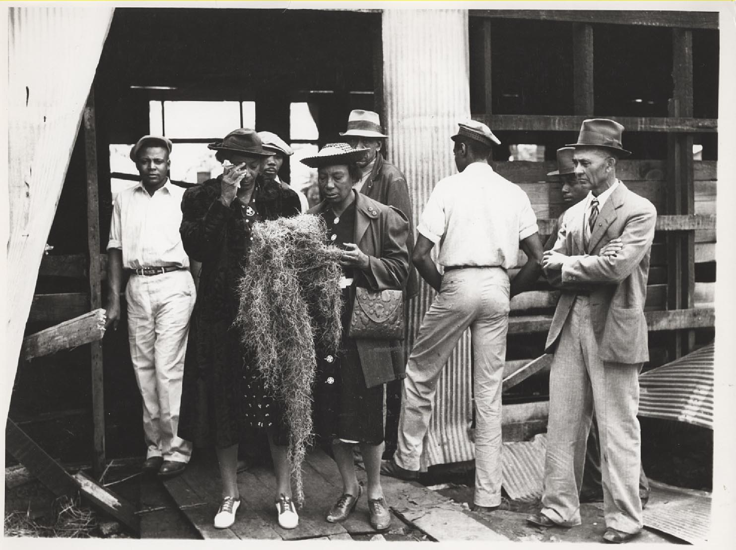
In 2019 my mother, who lives in Greensboro, North Carolina, had gone to get a pedicure. Sitting next to her was a Black woman who was from . . . Natchez. They struck up a conversation and my mother told her about my book Goat Castle, which is set in the city. Mom also wrote down the woman’s name and number so I could reach out to her. She told me the woman’s name was Ora Frazier. Her last name was very familiar to me. The man who operated the Rhythm Club on the night of the fire was Ed Frazier. My gut told me there was a connection and indeed there was. Ora’s husband, now deceased, was Ed’s son. This led to an oral history with Mrs. Frazier and photos I’d never seen of her late husband’s father. Listen to the universe.
Then, in the spring of 2021, I received an email from a man who had read a 2018 blog entry I wrote about the fire for We’re History. This is what it said:

This woman, Alice Kastor Campbell, was sixteen when the fire consumed the Rhythm Club and took the lives of several of her friends. As of this writing, she is the last surviving witness to that terrible tragedy yet she is so much more than that. Her life represents an entree into the world of Black Natchez during the years when it was a thriving community. And her son? It turns out that Ron Hendrix, the man who wrote to me, is an ER doctor. . . wait for it . . . in Mint Hill, a community less than 30 minutes from my home in Charlotte. Listen to the universe.
Not only did Ron’s email lead to two interviews with Alice, I have developed a friendship with him and have since assisted him in getting his mother’s writings into print. And, in February 2024, I am traveling to San Antonio, Texas, for Alice’s 100th birthday celebration where I will meet her in person for the very first time. Listen to the universe.
Between January and May of 2023, I felt I could return to the project. My goal was to write a book proposal and a sample chapter and then meet with book agents. All of that happened and yet I still shelved the project. The agents weren’t convinced but I kept trying to push ahead with the writing. The result was that I hit a brick wall and decided to shelve the project again. Listen to the universe.
The last four months have been, as the academics like to say, generative. I took time to breathe and cut myself some slack for not writing about the Rhythm Club. Then, in October, I had a wonderful opportunity to join fellow scholars in New Mexico to workshop essays for a volume to be called “Contested Commemorations.” I was invited because of my work on monuments and memory and actually wrote something new. It was an invigorating experience amid the beauty of Taos where we were meeting. I stayed a few extra days in the state to see a friend from my Mississippi days who now lives in Santa Fe. That visit restored my spirit in ways I had not anticipated. I returned from that trip transformed both personally and professionally. Listen to the universe.
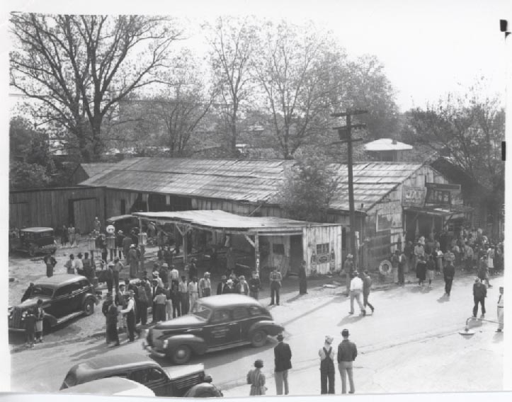
Only a few days later, I received what is known as a “funding alert” email. I always look even when there’s nothing that is well suited to my project. But this day, there was an alert for a summer fellowship with the Black Metropolis Research Consortium (BMRC) in Chicago. A significant part of my book project on the Rhythm Club is Chicago-based. Yes, the fire took place in Natchez. However, the jazz orchestra playing that evening was from Chicago. The Chicago Defender covered the story of the fire extensively. A group called the Natchez Social & Civic Club from Chicago raised money for the bronze plaque that memorializes the victims that sits on the Natchez bluff. Mississippi and Chicago are forever linked because of the Great Migration. I realized that my research was not complete and so I applied for the fellowship. I have since applied for a second short-term fellowship with the Newberry Library, also in Chicago. Listen to the universe.
Regardless of what happens with these applications, the gift of time has allowed me to rethink what my book on the Rhythm Club fire might look like and to consider its meaning beyond Natchez even though it most directly affected that community. The universe is speaking. And, I’m listening.

Photo courtesy of Alice Kastor Campbell.

 Then, in May, Louisiana University Press will release the volume


 Writing Goat Castle was the most rewarding endeavor of my career. I met wonderful people in Natchez, got to know descendants of one of the principals in the book, and was able to write a book that most people have found accessible. Everyone from my Aunt Wilma to my hairdresser seems to like it, and not just because they know me.